Thursday, March 25, 2010

"Can you tell a green field from a cold steel rail?"


Negative: Ilford PanF plus 50 (8m DDX)
Exposure: 50mm f/5.6 @ 1/250th
Printed At: 50mm f/16 1m
On: 8x10 RC grade 4
File: 14-26 & 14-27

There are a number of themes at work in this composition - and an overall continuation of the idea of movement. Also I'm aware that for some reason there's a number of train themed pictures in this series, which I think is OK. If you don't, well, too bad. :)

Some of this might seem like a stretch, but stay with me, I had to walk a really fine line with this title. For one thing you might have noticed that there are two file numbers for this print. I took two frames in quick succession as this train slowly went by. As a result, the black bar in the center is dividing the transposed sides of two almost identical images. At first glance it might look like the black bar is simply obstructing the middle of the frame, because there's really not much difference between the front of one car and the back of the next. In this case the cold steel rail is a laboratory construction from my darkroom - not the green field of real life. A black and white photograph in particular is an abstract construction representing reality - but people see these constructs as reality more often then the cold representations they really are.

I like trains for a variety of reasons, one of which is the fantastic efficiency at which they operate. A steel rail perhaps, but nothing could be closer to a green field for modern society than a diesel train pulling a couple hundred cars. This train in particular was carrying some phase of an agricultural progress; corn, I think.

Also in "A smile from a veil" I left the open question hanging about printing paper being sensitive to only part of the spectrum. No one commented with a hypothesis so I wasn't particularly motivated to answer right away. I'm not sure if anyone besides my wife is even reading this. I told her when she had the baby that her primary job outside of raising him was to comment on my blog whenever I post. She does a pretty good job.

So anyway the reason is that you don't need printing paper to be sensitive to more than a small slice of the spectrum. The end result is monochromatic anyway, and you're controlling the light in the darkroom. Safelights work by being red or orange, longer light waves which don't expose the paper but still let you see what you're doing. It's sort of easier to make prints than develop film because of this, when you develop panchromatic film it must be done in complete darkness. This means when I developed this film for 8 minutes in dektol, and 3 minutes in sprint fixer, I was in complete darkness for probably 15 minutes. It's weird to have no difference between eyes open and eyes shut for that long. I can't decide where to look sometimes, and sometimes I don't know if I'm cross-eyed. Sort of an unusual experience. It reminds me of a Quaker service in a way. It's peaceful and reflective.

Monday, February 15, 2010

"A smile from a veil"

Neg: Ilford PanF plus 50, push 100 (9min DDX@70farenheit)
Exposure: 50mm f/4 @ 1/125th
At: 45 +-15 dodge
On: 8x10 RC grade 4
File: 13-28

Subtitle: "I puked." He did- just before this frame.

So I fogged this roll by using old fixer. D'oh! I compensated by lowering the contrast of the lower part of the exposure where Claire's hands are. I need to buy some new fix.

I used some cool film for the first time, and I really liked the results- despite my bad chemistry. I'm going to try some more rolls. Some claim this film is too contrasty for everyday use- and indeed it is very high contrast. For this application it was perfect, as photographing babies is meant to be a high contrast affair. The other cool thing about this film, if you don't know from the name, is that it's panchromatic; sensitive to the entire visible spectrum (and often a bit more). A lot of other films are panchromatic or close to it, but I think this is great film for the price. I think it's definitely got more tonal range than TMax.

Panchromatic is your vocabulary word for the week. Photographic emulsions are often described as either orthochromatic (blue-light sensitive printing papers) or panchromatic (sensitive to the entire rainbow). Quiz time: why would printing papers only be sensitive to part of the spectrum?

Saturday, January 30, 2010

"Do you think you can tell?"


Exp: 50mm @ f/1.8 - 1/30th
Film: Kodak TMax 400
File: 12-11
At: -/2m
On: Ilford RC grade 4 8x10

This train was just pulling in to the station on a hazy day earlier this month. Sort of unusual to see an engine like this.

Just kidding. This is a G-scale (1/24th) model train I got a picture of at the train show with Marc a few weeks ago. I played with some of the development aspects to bring out a haziness in the final photo. Since I had my lens wide open, the depth of field was very short. Also the person in the background kind of looks like a big entrance that the train could have come through. The only thing really giving it away is the tracks.

Tuesday, December 15, 2009

"(and) did they get you to trade your heroes for ghosts?"


Exp: 28mm f/11 - 1/500 ... ish?
Film: Fuji Neopan 400 iso
File: 4-6
Print: Dodge burn 30sec +- 15 seconds (grade 4 matte)

The meta-information I usually provide is a bit different this time. I don't recall and didn't record my f/stop and exposure times, but judging by the depth of field and my memory of the lighting conditions, it looks to be f/11, which would have put this at around 1/500th, plus or minus a stop. It was a bright day and the "sunny 16" rule would have held. This rule of thumb says that at f/16 (which is only a couple of stops away from being a pinhole camera) on a sunny day, your shutter speed should be the reciprocal of the iso. I rarely use f/16 or higher because of a lack of sharpness at higher f stops (diffraction is to blame here, otherwise we'd use pinhole cameras), and an iso of 400 would mean 1/500th or 1/1000 would work for this exposure.

The negative had a very strong contrast between the top and bottom of this print, as the sunlight was very bright against the white surface. As a result I decided to use a gradient exposure on the print under the enlarger to darken the base and lighten the top. I did this by setting the timer for 45 seconds, covering the print, and slowly uncovering the print from the bottom up until there were only 20 seconds left to expose the top. Without doing this either the top is too dark, or the bottom is too light. I also played with some of the lighting in this print with iphoto, and had to uncrop the easeling my scanner tried to get rid of with Gimp - a free variant of Photoshop. Gimp can have a steep learning curve, so I tend to do some simple things in iPhoto for sanity.

The original negative is from a pre-baby trip we took to the National Law Enforcement Officer's Memorial in DC this summer. This memorial isn't as popular as it should be; I think most people don't really know it exists until a name they know is etched into the wall there. On the left of the print you can see some names of US law enforcement killed in the line of duty. It's a bit like the Vietnam memorial, except that the names are on a soft white surface instead of a glossy black one. One of the design ideas behind the Vietnam memorial was to reflect visitor's images in the names; I heard somewhere it was to get people to realize that someone just like them is in every name. Anyway I think it's a shame that visitors are more likely to visit statues of ghosts, rather than pay homage to heroes like these.

Another photo from the same roll of film appeared a while ago on this blog, "How they lived." I just looked back on that post, and I feel like I'm making progress. I hope I can say the same thing in another 6 months.

Also, here is a sample of some work I did as a pilot in commercial photography. I haven't figured out what I would charge for this kind of "everyday" work yet, but email me if you're interested. I'm likely more reasonable than most "professionals." If the lens flare in this picture isn't your style (I like it!) see the alternative picture further down, that might be more your speed.


The other bonus is that I license digital images under Creative Commons na 2.5, which means that unlike most cruel photographers who stamp your images with idiotic copyright watermarks and force your friends and family to pay for prints, you can share my digitals and print as many copies as you like. I mean, you already paid for the photographer to take the pictures, why do so many of these jerks try to squeeze a few extra dimes out of your friends and family? Again, all of my digitals for all time will be under this license, unless I explicitly state otherwise.

Anyway here's one more from the shoot. I made a special print of it for them in which I brought out more detail of the snow behind them. If you visit the Richart's, maybe you'll see it in their foyer!


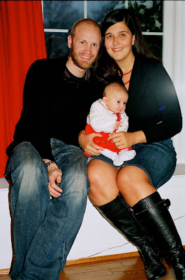
This is the single frame I managed to capture of a baby smiling with it's parents. No easy feat, let me tell you.

Sunday, November 29, 2009

"Hot ashes for trees"

Exp: 28mm @ f/2.8 - 1/60th
Film: Kodak TMax 400
File: 7-2
At: 1/1m
On: RC Ilford Warm Tone 8x10

This is a photograph of a sculpture which contains some of my dad's ashes - printed on trees - aka warm tone paper. The title and composition are a mix of metaphorical and literal interpretation. I decided one day in September that I wanted this picture and when we happened to visit my mom I got it in one exposure. I visualized the light from the middle of the metallic reflection on zone V, which gave the dolphins nice contrast with the darker base.

One of several of prints of this negatives is above my son's crib - which is what I wanted it for. His namesake is someone he'll never meet, but my dad is someone we'll make sure he knows. This picture is there more to remind us of that; he's just a baby!

I made a lot of "work" prints to get this just right, and I finally achieved the desired effect with "warm tone" paper. It was the first time I used warm and cool tone paper - which changes contrast and exposure time by about a stop. Warm tone paper is a full stop slower than the regular multigrade paper, so a "strait" print would have been 30sec, and a cool tone print took only 15 seconds.

Wednesday, November 18, 2009

"Hot air for a cool breeze"


Exp: 50mm @ f/4 - 1/500th
Film: Ilford Delta 100
File: 8-31
At: -/ 55
On: RC Ilford Grade 4 pearl (matte) 8x10

This is a picture of Great Falls park in Maryland from earlier in the fall. Claire and I decided to go for a hike there on her due date. Little did we know it was going to be another 12 days before our little guy came.

Anyway I really liked the symmetry of this composition, and the brightness of the sky and water almost makes it look orthochromatic. After I printed this I went out and got a #25 and #58 wratten number filters by Tiffen, these are red and green filters respectively. They pull down the overexposed sky for cloud details and mess with contrast and different tones - in the case of #58, foliage can be drastically affected.

I learned from reading my books on Ansel Adams that when photography was still immature, it was common for photographers to use a second negative with clouds on it to add to pictures like this. Apparently people just didn't notice that the same clouds seemed to follow these photographers wherever they went!

Tuesday, November 17, 2009

"Cold comfort for change"

Exp: 50mm @ f/8 - 1/250th
Film: Ilford Delta 400
File: 11-12
At: -/ 1.30
On: RC Ilford Grade 4 pearl (matte) 8x10

They say that it is the job of any artist to to document their place in history, which is what I had in my head when I decided I wanted this picture. This was the first of these I've seen in our neighborhood in a long time, and I was intrigued by this story. How much did they have to concede in order to sell? They obviously were happy at this house, who puts a statue and a plant out if they aren't? We're happy where we are right now, so like most people, we feel like it would be crazy to move, and give up so much potential future equity while the market is only just recovering. And recovering it is, slowly but surely if this photo is any evidence. But people will always desire to move ahead and forward, even if it means giving up that which was familiar and comforting.

As I go it's becoming easier to visualize what kind of a picture I want, and get it on a negative with one or two exposures. This was my goal all along with film photography, and I'm still finding that the added expense of film doesn't justify a much more expensive digital camera.

It took me a while to get to making this print, even though I've had the negative for a while because I took some extra time to construct a light trap for our bathroom (my darkroom) door. This is just a frame with handles on it that fits around the door. It's covered in a special black-out cloth to keep out the light. This worked great, except for one unexpected side effect. When you set up a trap like this, it also makes a pneumatic seal around the door. When I fired up the bathroom fan for ventilation, there was enough negative air pressure to cause the frame to fall inward, on me.